Creating a Portfolio in Flutter
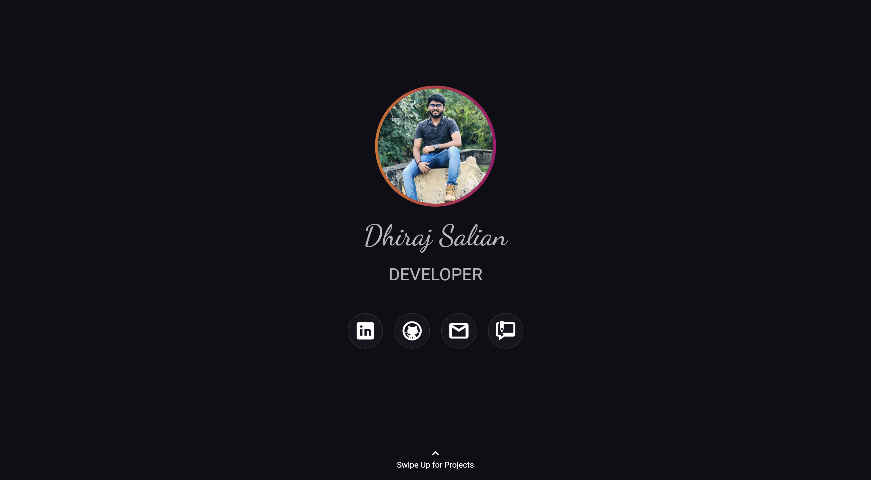
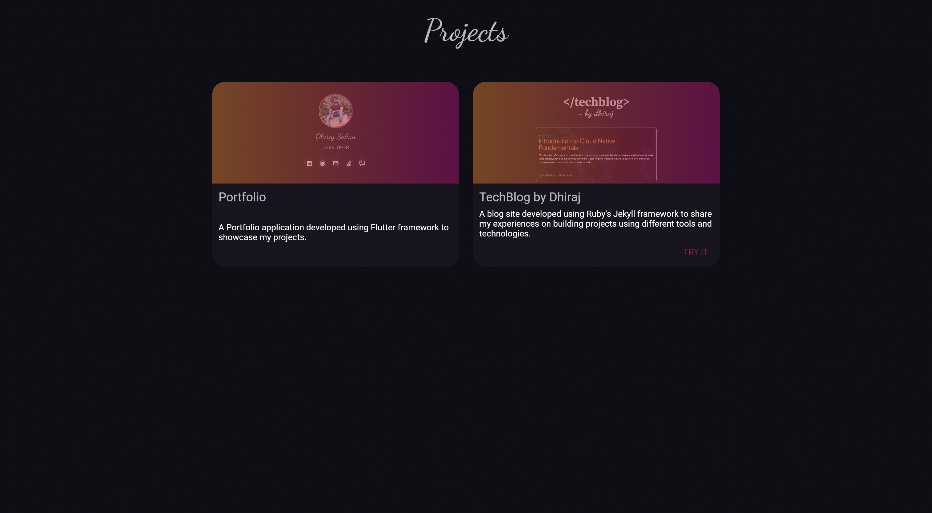
In this blog, we will learn to create flutter widgets for our portfolio. The portfolio consists of two pages - PortfolioPage and ProjectPage. We will learn to create widgets present in these pages.
Portfolio Page:
The portfolio page consists of many built in widgets like texts, icons, but we will mainly focus on building the avatar with a gradient border.

The easiest way to create a circle avatar in flutter is to use widget CircleAvatar.
Here is a code snippet which shows how to add a circle avatar.
Code:
class MyWidget extends StatelessWidget {
  @override
  Widget build(BuildContext context) {
    return const Center(
      child: CircleAvatar(
        radius: 100,
        backgroundImage: NetworkImage(
          'https://miro.medium.com/max/1400/1*mk1-6aYaf_Bes1E3Imhc0A.jpeg')
      )
    );
  }
}
Output:
![]()
As we know that CircleAvatar does not have a border property. The easiest way to achieve a border is to wrap the CircleAvatar with a Padding Widget inside another container with circle shape.
The padding of the padding widget will act as the border width and the background color of the circle shaped container will act as border color.
The background color of the container can also be changed to gradient using BoxDecoration widget’s gradient property.
Code:
class MyWidget extends StatelessWidget {
  @override
  Widget build(BuildContext context) {
    return Container(
      child: const Padding(
        padding: EdgeInsets.all(10),
        child: CircleAvatar(
          radius: 100,
          backgroundImage: NetworkImage(
            'https://miro.medium.com/max/1400/1*mk1-6aYaf_Bes1E3Imhc0A.jpeg'),
        ),
      ),
      decoration: BoxDecoration(
        shape: BoxShape.circle,
        gradient: LinearGradient(
          colors: [
            Theme.of(context).colorScheme.secondary,
            Theme.of(context).colorScheme.primary,
          ],
        ),
      ),
    );
  }
}
Output:
![]()
Projects Page:
The project page consists of a single type of widget which I call project card. We will focus on building this widget which displays the project information and image in a card.

To build the project card we will be using a Card widget. This Card widget will be divided into two parts. The first part will contain the image of the project and the second part will contain the project description.
To achieve this layout, we will be using a Column widget inside Card widget. The column widget will consist of two Expanded widgets. The Expanded widget has a property called flex which helps in sizing of each Expanded widget inside Column widget.
The first Expanded widget will be used to display the image of the project with a translucent gradient layer on top of it. The second Expanded widget will be used to display the project details and buttons for the links.
Note: The first Expanded widget might overflow the Card widget’s border. So we will be adding a clipping behaviour to contain the first Expanded widget inside Card widget.
Code:
class MyWidget extends StatelessWidget {
  @override
  Widget build(BuildContext context) {
    return Card(
      shape: const RoundedRectangleBorder(
        borderRadius: BorderRadius.all(Radius.circular(20)),
      ),
      clipBehavior: Clip.antiAliasWithSaveLayer,
      color: const Color.fromRGBO(23, 21, 30, 1),
      child: Container(
        width: 500,
        constraints: const BoxConstraints(
          maxHeight: 300,
          maxWidth: 400,
        ),
        child: Column(
          children: [
            Expanded(
              flex: 11,
              child: Container(
                decoration: const BoxDecoration(
                  image: DecorationImage(
                    image: NetworkImage(
                      'https://miro.medium.com/max/1400/1*mk1-6aYaf_Bes1E3Imhc0A.jpeg'),
                    fit: BoxFit.cover,
                  ),
                ),
                child: Opacity(
                  opacity: 0.55,
                  child: Container(
                    decoration: BoxDecoration(
                      gradient: LinearGradient(
                        colors: [
                          Theme.of(context).colorScheme.secondary,
                          Theme.of(context).colorScheme.primary,
                        ],
                      ),
                      backgroundBlendMode: BlendMode.colorBurn,
                    ),
                  ),
                ),
              ),
            ),
            Expanded(
              flex: 9,
              child: Padding(
                padding: const EdgeInsets.all(10.0),
                child: Column(
                  crossAxisAlignment: CrossAxisAlignment.start,
                  children: [
                    Text(
                      'My Project Title',
                      style: Theme.of(context).textTheme.headline5,
                    ),
                    const Spacer(),
                    Text(
                      'My Project Description',
                      style: Theme.of(context).textTheme.bodyText1,
                      overflow: TextOverflow.ellipsis,
                      maxLines: 3,
                    ),
                    const Spacer(),
                    Row(
                      mainAxisAlignment: MainAxisAlignment.end,
                      children: [
                          TextButton(
                            onPressed: () => {},
                            child: const Text('TRY IT'),
                          ),
                          TextButton(
                            onPressed: () => {},
                            child: const Text('KNOW MORE'),
                          ),
                      ],
                    )
                  ],
                ),
              ),
            )
          ],
        ),
      ),
    );
  }
}
Output:
![]()
If you would like to see the portfolio in action, please visit dhirajsalian.com. The project source code can be found here.
Comments